Lab 7. Time Series Proportional Symbols
Due: 11:59 pm, Wednesday, 11/20
Overview
In this lab, we will create a time series proportional symbol map with Leaflet and JQuery (another JS library). This lab exercise is modified from this tutorial.
The scripts contain a lot of function definitions and may be difficult to follow if you are trying to understand them line by line. I have provided comments as explanations. However, you may use the scripts as a template to map data with a similar structure. I am always happy to explain in more details if you are interested in learning the syntax.
Please read the instructions carefully and submit your complete time slider map (there is no additional deliverable for lab 7).
*******************************************************************************************************************
Prepare Time Series Data
The first step for the spatiotemporal visualization is to create a time series dataset. As an example, I'll map population dynamics of fifteen major U.S. cities. Below is an example of what the dataset looks like (a .csv file):
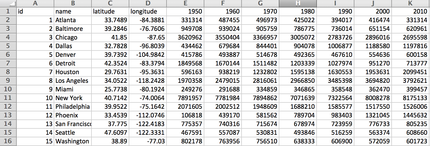
- Click here to download the example data. Spend some time to make sure you understand the data structure.
- We will introduce an online platform for displaying points with coordinates this time, which may come in handy when other GIS processing (e.g., table join, simplify geometry) is not required.
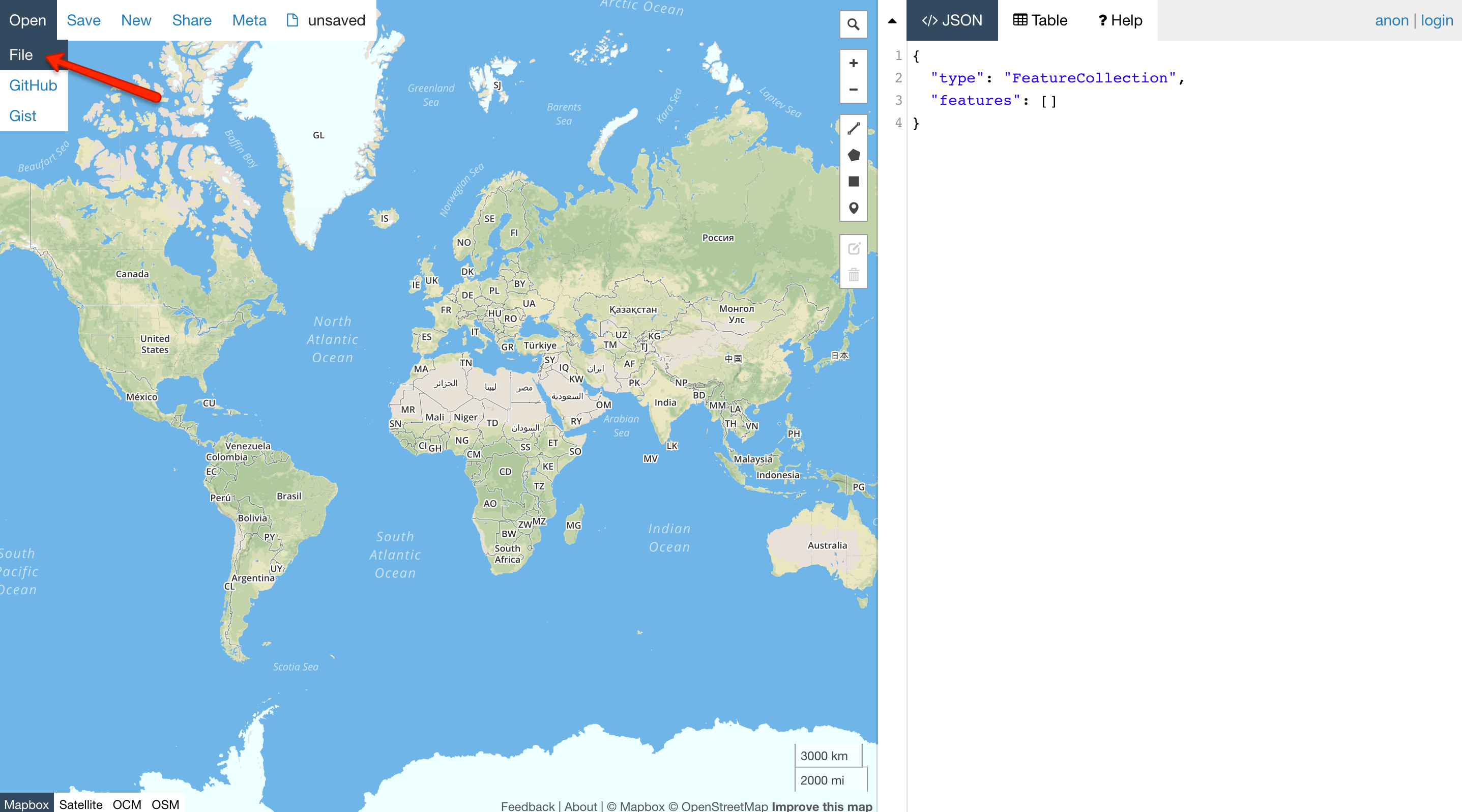
- In your web browser, go to geojson.io, select Open (see image below) to open the csv file you have just downloaded.
- The data, i.e., 15 U.S. cities, should have been loaded as points/markers to the site.
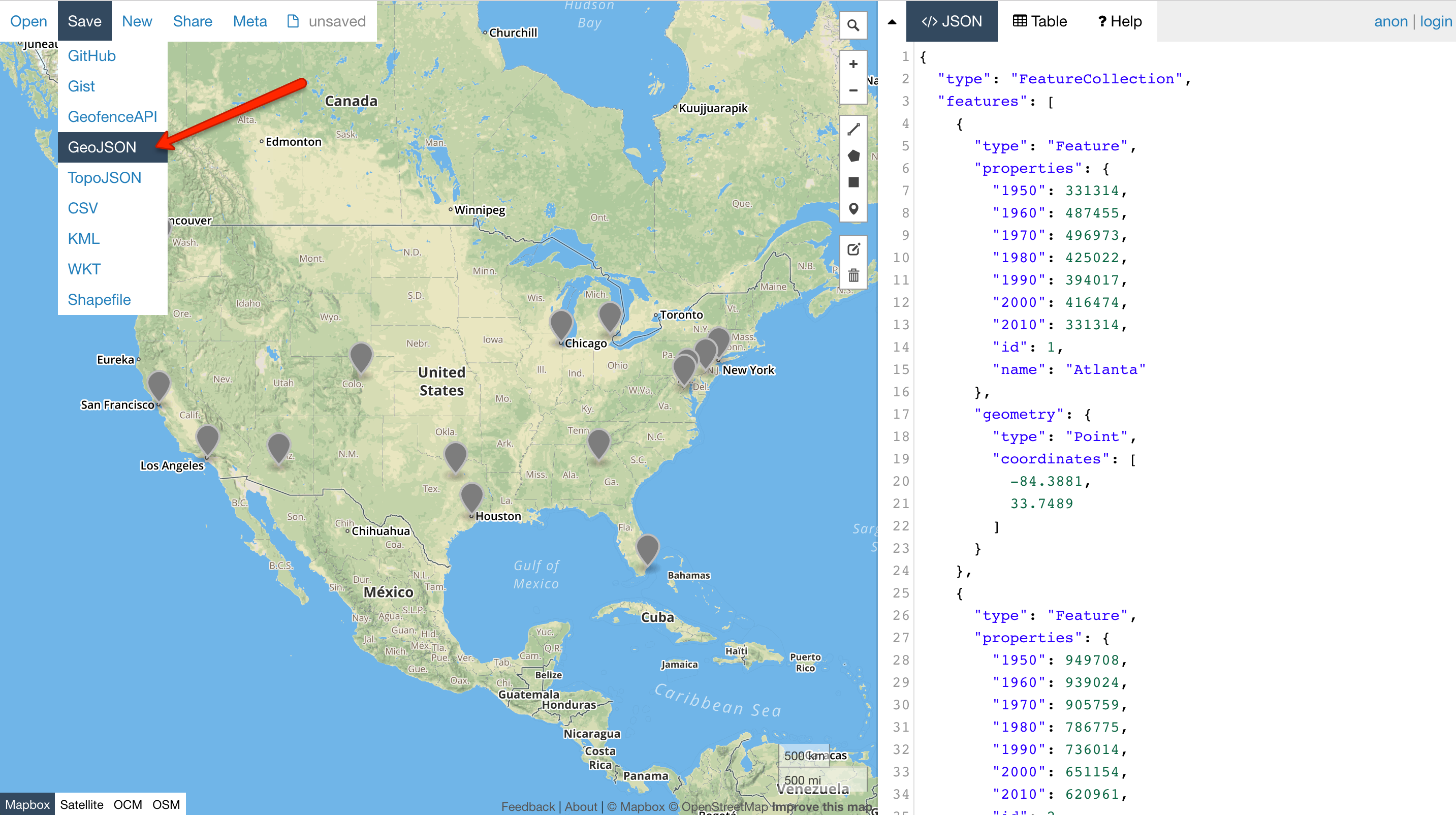
- Next, click Save - GeoJSON to save the data as a geojson file to your lab 7 folder.
- Since we use a JQuery function to read/parse the data this time, we can keep the .geojson file for mapping - there is NO need to save it as a .js file.
Proportional Symbol Map
We will map the city population data as proportional symbols. Not sure what is a proportional symbol map? - click here to learn more.
- First, open your code editor and set up the basemap to show the contiguous U.S. in fullscreen mode, and save the document as
map7.htmlto your lab 7 folder, where the geojson file was saved. - Next, reference the JQuery libraries so that we could use the JQuery functions (add to the
headsection):<script src="https://code.jquery.com/jquery-3.5.1.min.js" integrity="sha256-9/aliU8dGd2tb6OSsuzixeV4y/faTqgFtohetphbbj0=" crossorigin="anonymous"></script> <script src="https://code.jquery.com/ui/1.12.1/jquery-ui.min.js" integrity="sha256-VazP97ZCwtekAsvgPBSUwPFKdrwD3unUfSGVYrahUqU=" crossorigin="anonymous"></script> - This time, we use a JQuery function
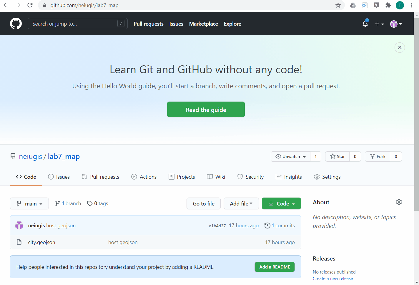
getJSON()to load the GeoJSON data directly. However, this function requires a hosted absolute url of the geojson file. To do this:- Upload the geojson file to GitHub first - start a new repository where you will publish your map.
- Next, click the geojson file in the repository and select Raw to copy the hosted link of the geojson file (see the demonstration below). Note that only the raw link to the geojson file works as an absolute url.
- To use the
getJSON()function, a$sign is used to define/access jQuery. Place the following lines AFTER adding the tile layer. Note you may need to change the url of the geojson file to match yours://change the file url to match yours $.getJSON("https://raw.githubusercontent.com/neiugis/lab7_map/main/city.geojson") // The getJSON() method is used to get JSON data .done(function(data) { }); - The data won't show up on the map at this point. We will define how to draw the data in the following steps.
- We first define a function to process the data to acquire the timestamps (the year columns) and the maximum and minimum population values to be used for creating the legend.
Add the function below (you may name the function differently) following the loading data portion:function processData(data) { // First, initialize the variables to hold the timestamps and min/max population values var timestamps = []; // square brackets to define an array of data // because there are multiple timestamps var min = Infinity; // for the min, begin with the largest possible value - infinity var max = -Infinity;// for the max, begin with the smallest possible value - negative infinity // Go through each row/feature of the data table // Note data is the variable name in the function definition - processData(data) for (var feature in data.features) { var properties = data.features[feature].properties; // At each row, go through the columns/attributes to get the values for (var attribute in properties) { if ( attribute != 'id' && attribute != 'name' && attribute != 'latitude' && attribute != 'longitude' ) // != means NOT EQUAL TO // These columns are NOT recorded // Modify this part when mapping your own data { if ( $.inArray(attribute,timestamps) === -1) { // JQuery in.Array() method searches for a specified value within an array and return its index (or -1 if not found) // here, the new timestamp is only added when it is not already in the array // triple equals === compares both type and value timestamps.push(attribute); // The JS push() method adds new items to the end of an array // and returns the new length of the array } if (properties[attribute] < min) { min = properties[attribute]; // record/update the current smaller values as the min } if (properties[attribute] > max) { max = properties[attribute]; // record/update the current larger values as the max } } } } return { // the function finally returns the timestamps array, the min and max of population data timestamps : timestamps, min : min, max : max } } - Read the comment lines to learn more about what this function does exactly. It looks like a lot going on. But when you map your own data, the only places you need to change are the attribute/column names that are NOT supposed to be mapped ('id', 'name', 'latitude', 'longitude' in this case).
- Next, add the functions below to draw proportional symbols (following the processing data portion):
Again, a lot of things going on here. But you ONLY need to adjust the popup content (as we did before) and the scale factor (depending on the value and map scale) for making your own maps. And of course, customize the colors and styles of the circles as you like.
// The function to draw the proportional symbols function createPropSymbols(timestamps, data) { cities = L.geoJson(data, { // By default, Leaflet draws geojson points as simple markers // To alter this, the pointToLayer function needs to be used pointToLayer: function(feature, latlng) { return L.circleMarker(latlng, { // we use circle marker for the points fillColor: "#501e65", // fill color of the circles color: '#501e65', // border color of the circles weight: 2, // circle line weight in pixels fillOpacity: 0.5 // fill opacity (0-1) }).on({ mouseover: function(e) { this.openPopup(); this.setStyle({fillColor: 'green'}); // fill color turns green when mouseover }, mouseout: function(e) { this.closePopup(); this.setStyle({fillColor: '#501e65'}); // fill turns original color when mouseout } }); } }).addTo(map); updatePropSymbols(timestamps[0]); // this function is defined below // When loaded, the map will first show proportional symbols with the first timestamp's data } // The function to update/resize each circle marker according to a value in the time series function updatePropSymbols(timestamp) { cities.eachLayer(function(layer) { // eachLayer() is an Leaflet function to iterate over the layers/points of the map var props = layer.feature.properties; // attributes var radius = calcPropRadius(props[timestamp]); // circle radius, calculation function defined below // pop-up information (when mouseover) for each city is also defined here var popupContent = props.name + ' ' + timestamp + ' population: ' + String(props[timestamp]) ; layer.setRadius(radius); // Leaflet method for setting the radius of a circle layer.bindPopup(popupContent, { offset: new L.Point(0,-radius) }); // bind the popup content, with an offset }); } // calculate the radius of the proportional symbols based on area function calcPropRadius(attributeValue) { var scaleFactor = 0.001; // the scale factor is used to scale the values; the units of the radius are in meters // you may determine the scale factor accordingly based on the range of the values and the mapping scale var area = attributeValue * scaleFactor; return Math.sqrt(area/Math.PI); // the function return the radius of the circle to be used in the updatePropSymbols() } - Next, we will call the defined functions in the loading data portion to apply them. MODIFY the getJSON function to add the data processing and symbol drawing functions we just defined:
$.getJSON("https://raw.githubusercontent.com/neiugis/lab7_map/main/city.geojson") .done(function(data) { var info = processData(data); createPropSymbols(info.timestamps, data); }); - Your map should be displayed as proportional symbols with the first timestamp's data at this point (sample code):
Add a Time Slider
Now we will add the time slider, with labels, to animate the temporal data. For this lab, we will use the HTML5 range type to create a simple slider.
- Add the functions below AFTER the drawing symbol portion:
function createSliderUI(timestamps) { var sliderControl = L.control({ position: 'bottomleft'} ); // position of the slider // Another use of L.control :) sliderControl.onAdd = function(map) { //initialize a range slider with mousedown control var slider = L.DomUtil.create("input", "range-slider"); L.DomEvent.addListener(slider, 'mousedown', function(e) { L.DomEvent.stopPropagation(e); }); // Define the labels of the time slider as an array of strings // Modify this for your data var labels = ["1950", "1960","1970","1980", "1990", "2000","2010"]; $(slider) .attr({ 'type':'range', 'max': timestamps[timestamps.length-1], 'min':timestamps[0], 'step': 10, // Change this to match the numeric interval between adjacent timestamps 'value': String(timestamps[0]) }) .on('input change', function() { updatePropSymbols($(this).val().toString()); // automatic update the map for the timestamp var i = $.inArray(this.value,timestamps); $(".temporal-legend").text(labels[i]); // automatic update the label for the timestamp }); return slider; } sliderControl.addTo(map); createTimeLabel("1950"); //The starting timestamp label } // Add labels to the time slider when the map first loaded function createTimeLabel(startTimestamp) { var temporalLegend = L.control({position: 'bottomleft' }); // same position as the slider // One more use of L.control !! temporalLegend.onAdd = function(map) { var output = L.DomUtil.create("output", "temporal-legend"); $(output).text(startTimestamp); return output; } temporalLegend.addTo(map); } - For your own data, you will need to change the
stepvalue to match the interval between adjacent timestamps (10 in this example), and also change the label texts. - Then, MODIFY the getJSON function to add the slider creation function:
$.getJSON("https://raw.githubusercontent.com/neiugis/lab7_map/main/city.geojson") .done(function(data) { var info = processData(data); createPropSymbols(info.timestamps, data); createSliderUI(info.timestamps); }); - The simple slider is added to the map, at your defined position (I used bottom left) (sample code):
Add a Legend
We are almost there! The last step is to add a legend for the proportional symbols.
- We will first define the
createLegend()function. Add the function BELOW time slider functions. The function creates a legend using the minimum, half-maximum, and maximum symbol sizes, with their corresponding rounded values as labels.function createLegend(min, max) { if (min < 10) { min = 10; } function roundNumber(inNumber) { return (Math.round(inNumber/10) * 10); } var legend = L.control( { position: 'bottomright'} ); legend.onAdd = function(map) { var legendContainer = L.DomUtil.create("div", "legend"); var symbolsContainer = L.DomUtil.create("div", "symbolsContainer"); var classes = [roundNumber(min), roundNumber((max-min)/2), roundNumber(max)]; var legendCircle; var lastRadius = 0; var currentRadius; var margin; L.DomEvent.addListener(legendContainer, 'mousedown', function(e) { L.DomEvent.stopPropagation(e); }); $(legendContainer).append("<h2 id='legendTitle'>Total Population</h2>"); for (var i = 0; i <= classes.length-1; i++) { legendCircle = L.DomUtil.create("div", "legendCircle"); currentRadius = calcPropRadius(classes[i]); margin = -currentRadius - lastRadius - 5; $(legendCircle).attr("style", "width: " + currentRadius*2 + "px; height: " + currentRadius*2 + "px; margin-left: " + margin + "px" ); $(legendCircle).append("<span class='legendValue'>"+classes[i]+"</span>"); $(symbolsContainer).append(legendCircle); lastRadius = currentRadius; } $(legendContainer).append(symbolsContainer); return legendContainer; }; legend.addTo(map); } - Next, we will define the styles of the legend. Add the lines below in the
stylesection of theheadsection..legend, .temporal-legend { padding: 6px 15px; font: 14px/16px Arial, Helvetica, sans-serif; background: white; background: rgba(255,255,255,0.8); box-shadow: 0 0 15px rgba(0,0,0,0.2); border-radius: 5px; } #legendTitle { text-align: center; margin-bottom: 15px; font-variant: small-caps; } .symbolsContainer { float: left; margin-left: 50px; } .legendCircle { border-radius:50%; border: 2px solid #501e65; background: rgba(80, 30, 101, .5); display: inline-block; } .legendValue { position: absolute; right: 8px; } - Then, MODIFY the getJSON function to add the
createLegend()function:$.getJSON("https://raw.githubusercontent.com/neiugis/lab7_map/main/city.geojson") .done(function(data) { var info = processData(data); createPropSymbols(info.timestamps, data); createSliderUI(info.timestamps); createLegend(info.min,info.max); }); - Here is the final map! (sample code):
Deliverables
For the deliverables, simply host your map via GitHub (Make sure to rename the html file as index.html and upload any associated data files to the repository!!!) and submit the url through D2L.